UX Research
New-Hire HR Onboarding

Problem:
New hires for companies are reporting that the onboarding process to begin their new job is confusing and taking much longer than they would expect. Named issues include overwhelming quantities of paperwork, confusing forms, too many systems to log into and having too many questions throughout the process.
This issue causes high turnover rates, longer time with unfulfilled positions, disengaged employees, pushed back deadlines, and delayed ROI's.
Research:
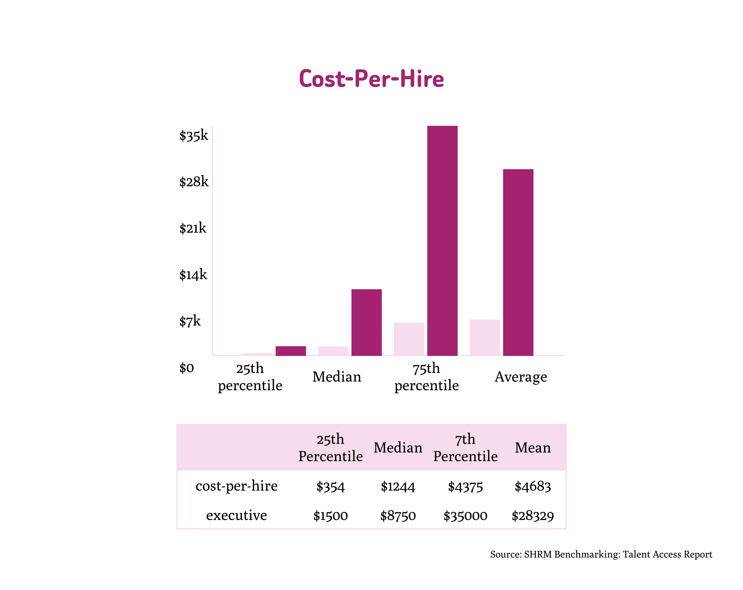
$4000 lost per employee turnover on average. Not including the soft costs like time and resources spent training, increased workload strain/decreased productivity on existing employees.
Software for the onboarding process can be confusing and cause information overload for the new employee. Unclear deadlines, lack of self-help, no progress tracking or prioritization stalls the process.
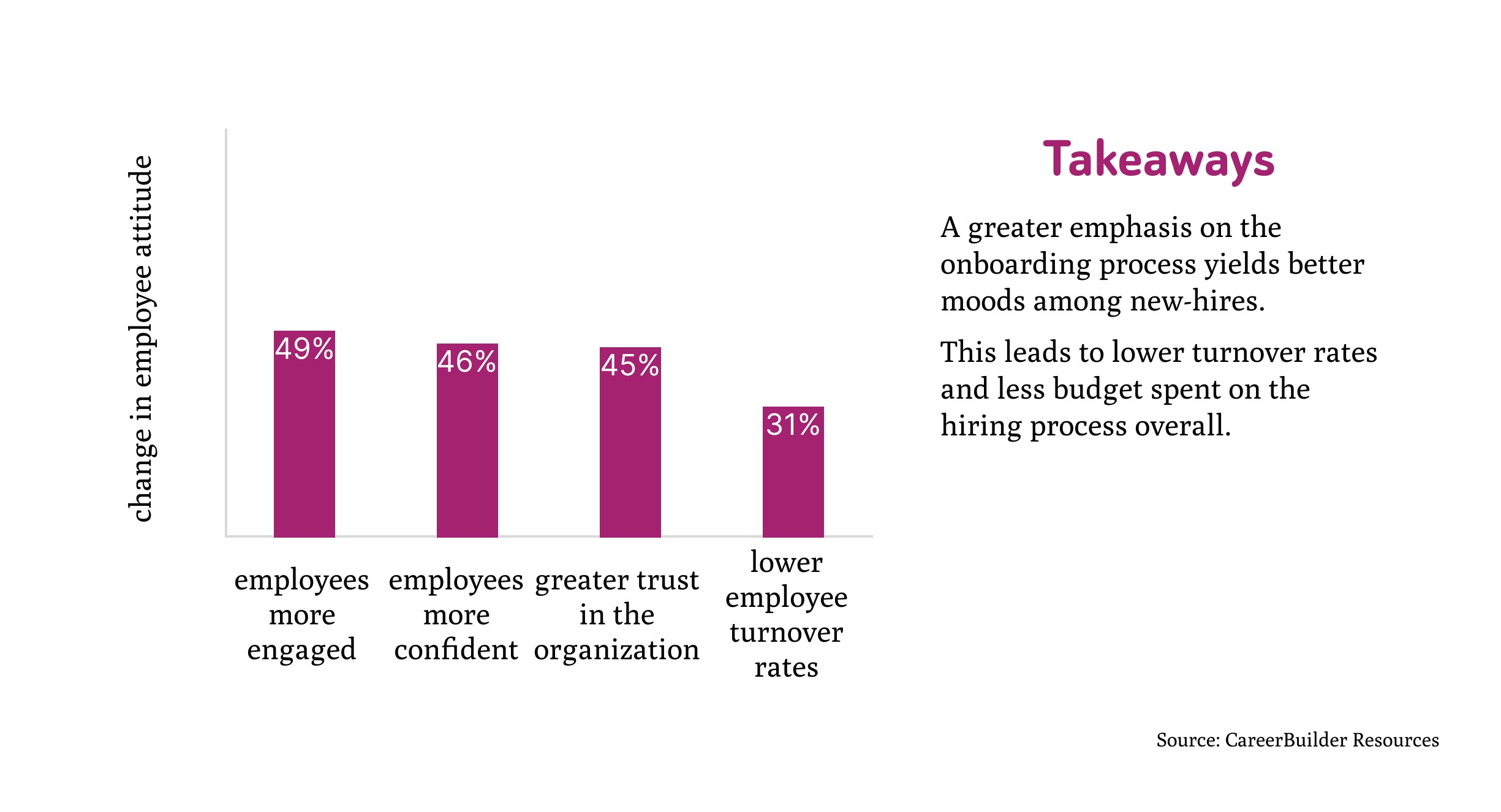
According to a study by CareerBuilder, employers who placed a large emphasis on their onboarding process reported that employees were more engaged (49%), more confident (46%), and had greater trust in the organization (45%). Employers have also reported 31% lower employee turnover rates.
Solution:
Design an employee onboarding app prototype that:
Streamlines new user journeys,
Provides progress tracking for said new users.
These solutions will help the user along to speed up onboarding and produce a pleasant experience for the employee, ultimately cut down turnover rates.
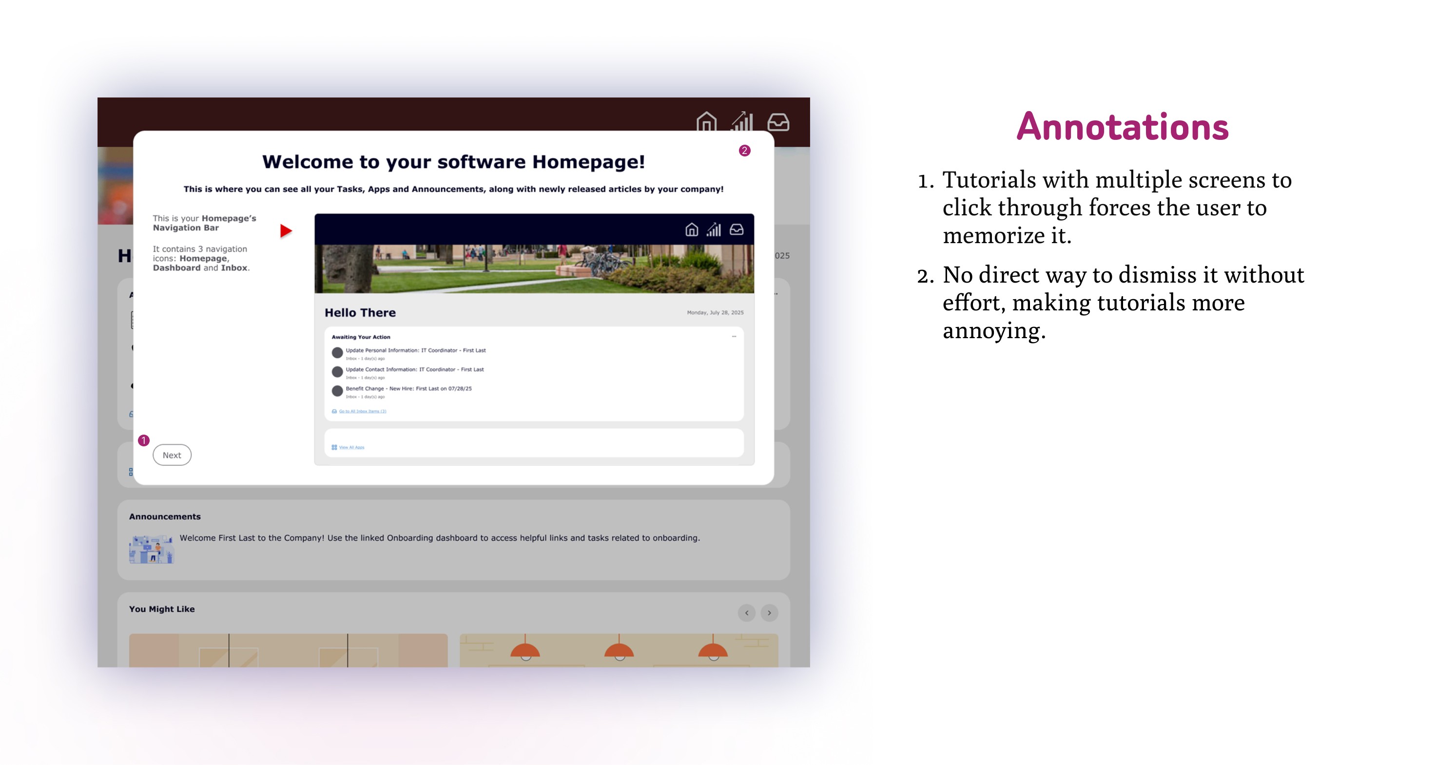
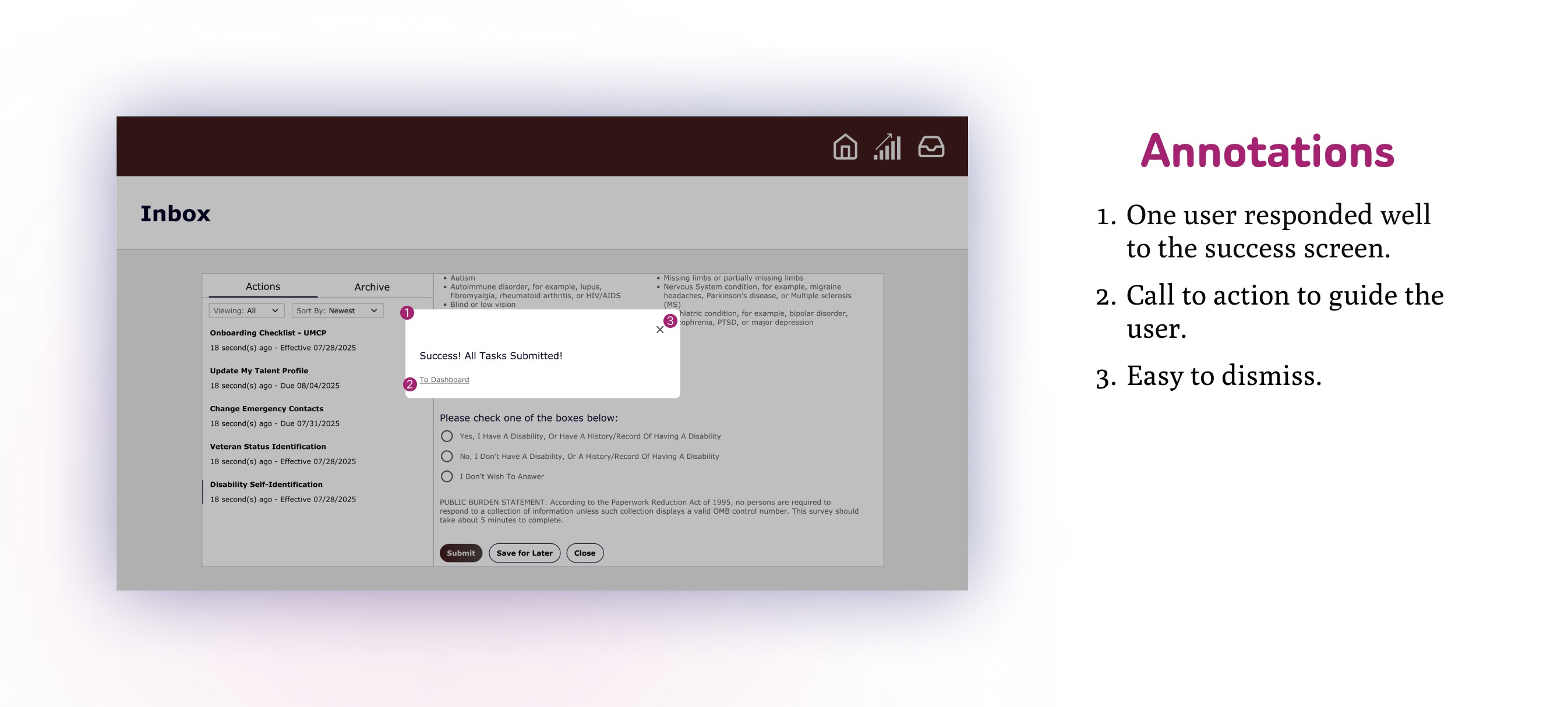
In order to collect some initial data for primary research, I started with designing a prototype for an HR onboarding app in Figma modeled after Workday's software interface. In this prototype, I designed a homepage, a dashboard, and an inbox with onboarding tasks. There were 10 tasks in total for my user testers to complete. A multi-page tutorial was created for each of the main pages to gauge how users felt about tutorials, and a success overlay was also created for when the user completed all tasks.
After completing the trials, they were asked 5 questions:
Was this your first time using a software like this?
Was it confusing to navigate this software?
Did the tutorials at the start of each new interface help or hurt your understanding?
Was there a sense of fulfillment as you completed each task?
Was there any time when you weren’t sure if what your submissions were successful?
And the notable responses were:
⅔ users said it was not their first time with this type of software.
Another ⅔ users said it was confusing to navigate.
⅔ users said the tutorials were too much information at once and the other ⅓ said the tutorials were irrelevant.
⅔ users said there wasn’t enough of a sense of fulfillment to be notable. The other ⅓ responded well to the “task complete” notifications.
⅔ users said it was difficult to tell when submissions were successful.
Takeaways from testing:
More than half of the testers were already familiar with onboarding software and still they found it difficult or confusing to navigate. This indicates that clearer navigation and direction must be implemented into the UI.
The responses seemed to indicate that tutorials are too much information at once and impede progress. A different method was needed to provide guidance in a non-invasive way.
Responses to the questions regarding sensations of task completion and submission feedback indicate there is a need for a UI with better feedback signals.
This proved to me that tutorials are not only ineffective in providing guidance to new or experienced users, but they are actually counterproductive. A different method was needed to accomplish the task of providing guidance in a non-invasive way.
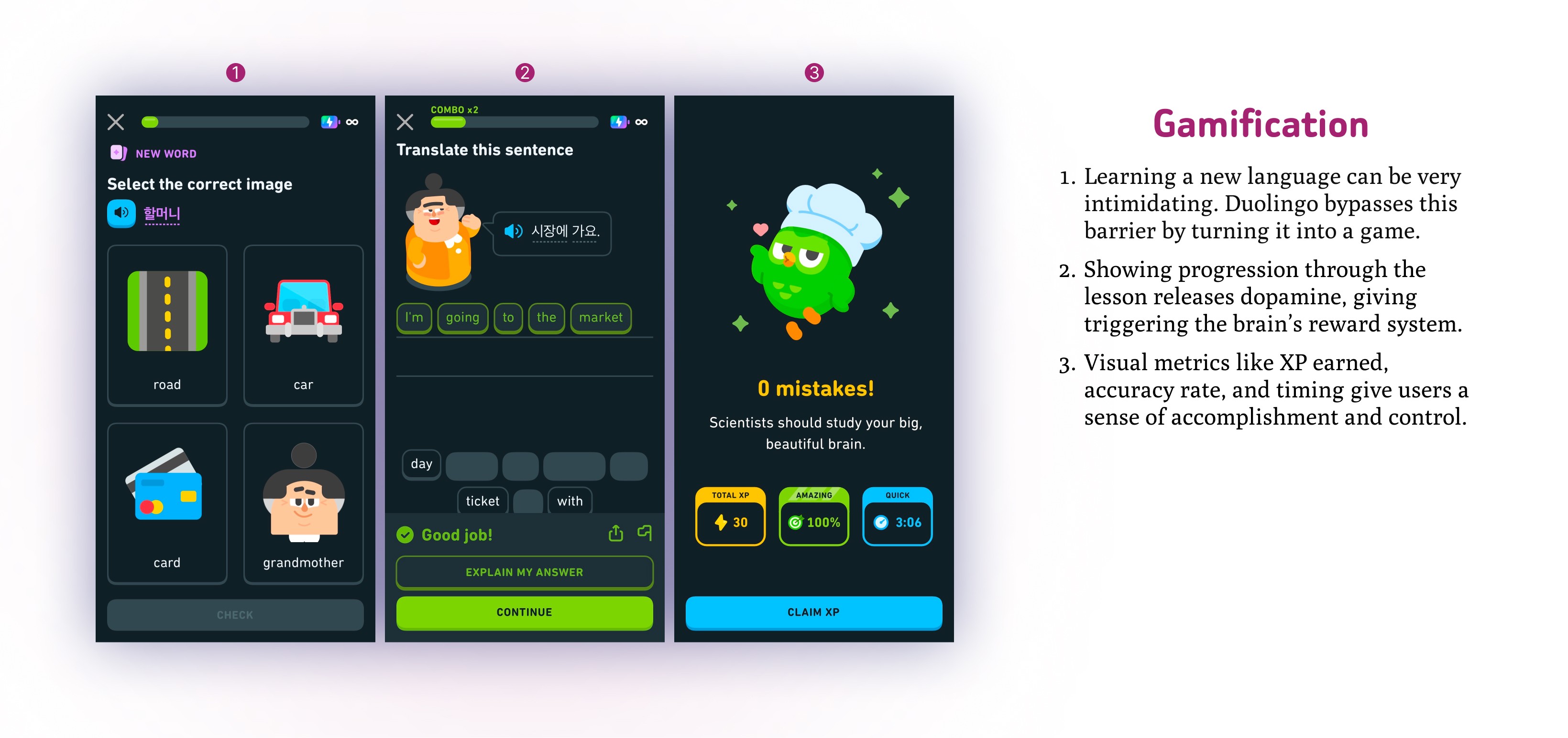
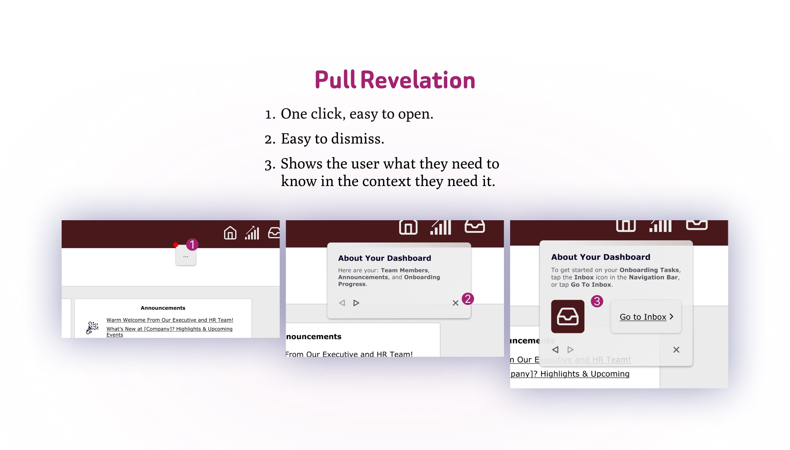
To solve the issue presented by the tutorials, I researched alternative methods to provide feature context while not being invasive. In my search, I came upon an article by Nielsen Norman Group titled Onboarding Tutorials vs. Contextual Help. What they found was similar to what I discovered from the results of the first round of user testing: Tutorials are counterproductive, are almost always skipped and disrupt the flow of the user. What they found that actually worked were pull revelations, which they defined as 'help content triggered by some signal that the user would benefit from that information at that moment.' The key to implementing pull revelations is to make them visible but not in the way and easy to dismiss and recall.
The other issue that came up during user testing was that users didn't feel a notable sense of fulfillment and that it was difficult to tell when submissions were successful. To address this, I looked for existing interfaces that used gamification. One company that really leans into gamification was the popular language learning app Duolingo. Duolingo reported that 80% of their user base enjoyed its gamification, and it was also noted that instant feedback gave users a sense of control with their progress.
Another article I found regarding gamification was from MasterCard Services, who claimed that gamification 'satisfies a fundamental human desire to achieve recognition and rewards and gain status and achievements'. They also found that gamification increased their customer engagement 60%!
In short, my priorities were implementing gamification and non-invasive pull revelations.
For pull revelations, I built a small pop-out near the top of the page that users would be able to easily open and close. It was non-invasive, yet still visible, and easy to dismiss and recall.
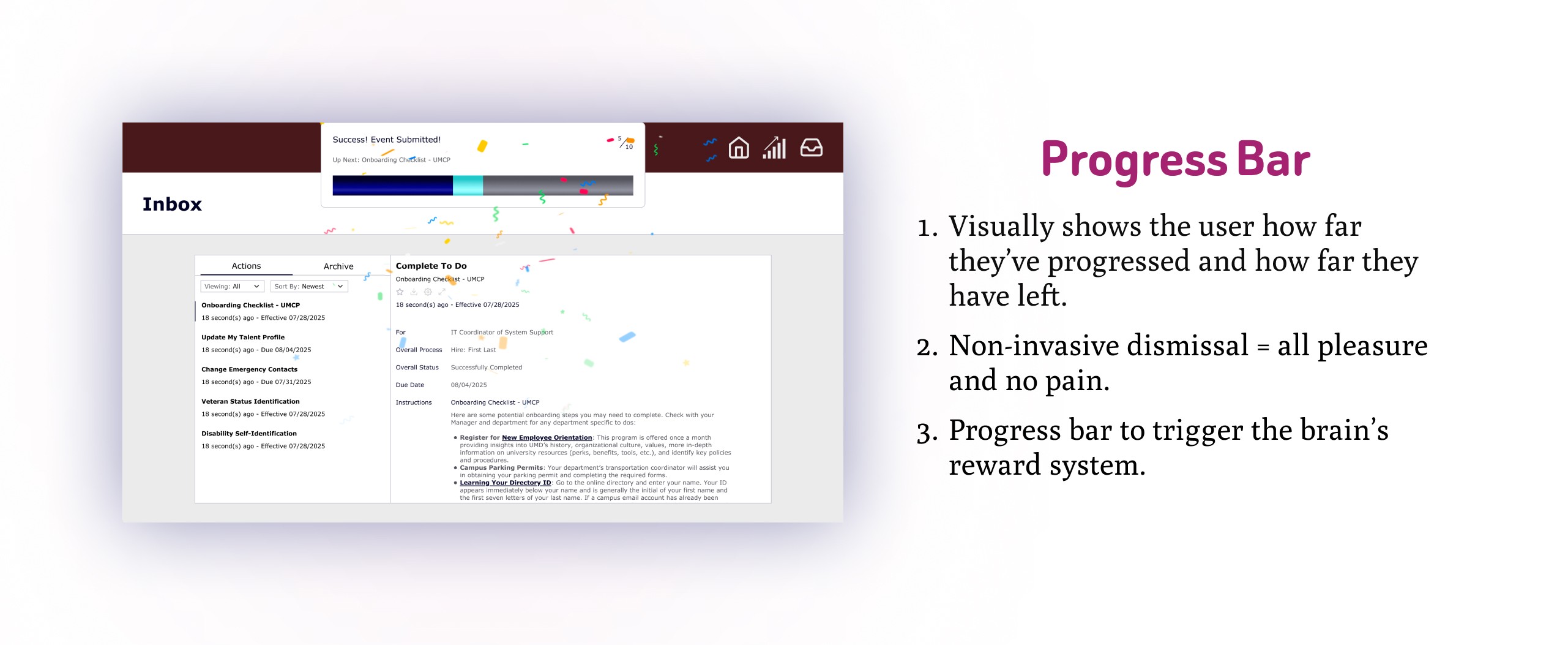
With gamification, I designed an overlay featuring a colored progress bar that dropped down when the user completed a task. The drop down overlay would dismiss itself a short period after dropping down, or the user could click anywhere on the page to dismiss it, making it more user-friendly.
I re-tested the prototype with the new features with 3 other users, asking the same interview questions as before, with the exception of the tutorial question:
All 3 said it wasn't their first time using this type of software.
⅔ said it wasn't confusing, while the 3rd user said it was only confusing at first.
⅔ users said they didn't think to interact with the pull revelations and the 3rd said they noticed it was there but wasn't sure what it was supposed to be.
⅔ users said there was a sense of fulfillment noting that the progress bar was helpful, and the 3rd user said it gave them the same sense of fulfillment as completing new training at their job.
All 3 users said the feedback made it clear that their submissions were successful.
The takeaways were as follows:
The gamification elements were very successful. There was no confusion about whether their submissions were registered, and users felt accomplished and fulfilled after completing each task.
The pull revelations on the other hand didn't yield the results I had been aiming for. The users hadn't interacted with the feature nor did they think they should have interacted with it. After user interviews, I discovered that the pull revelations were not being noticed by users.
Implementing gamification upon task completion yielded positive results. However, my implementation of pull revelations was NOT successful. For the next round of testing, I brainstormed ways to implement pull revelations that announced themselves to users and made it clear what they were.
I decided to research more UX principles and found some that I implemented in my next solution.
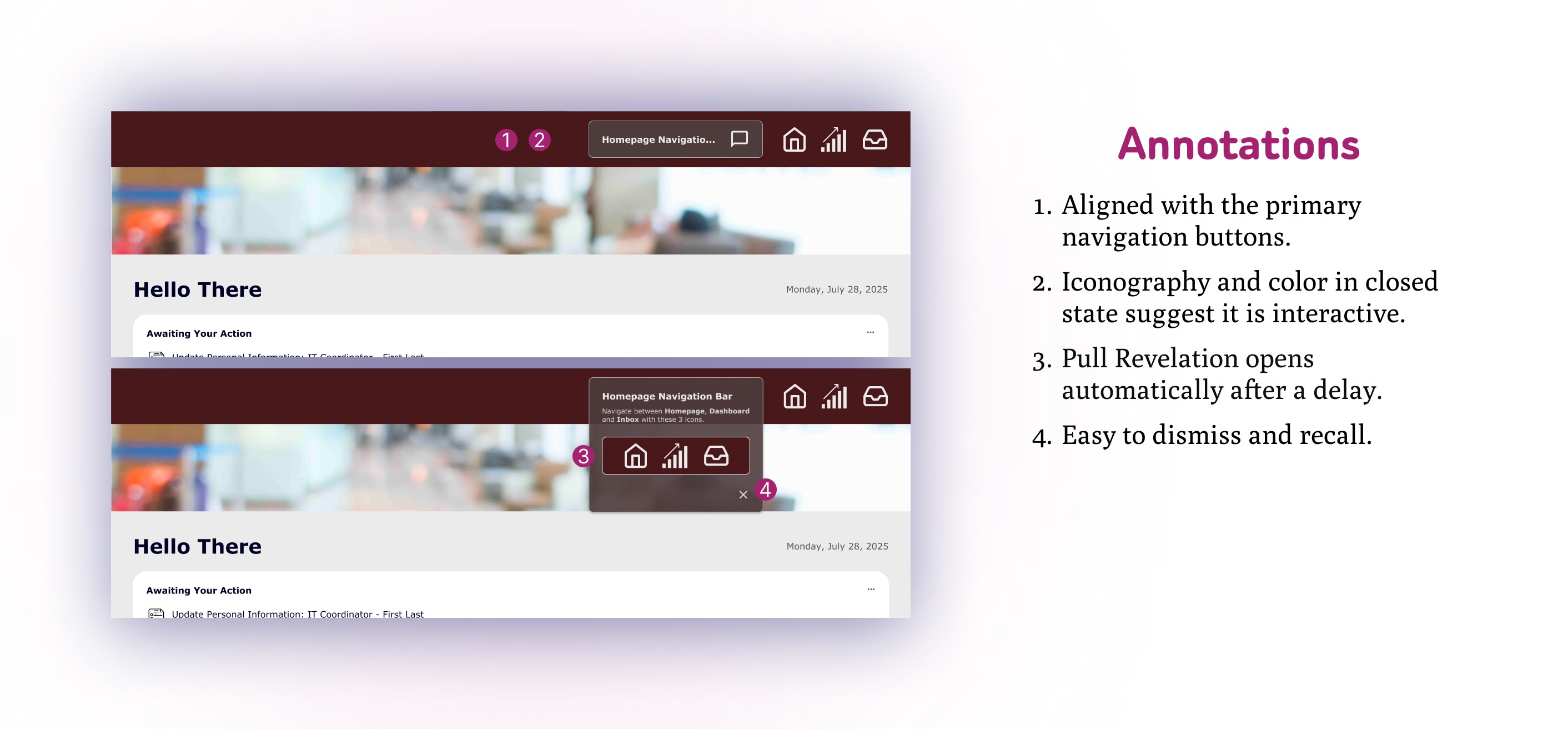
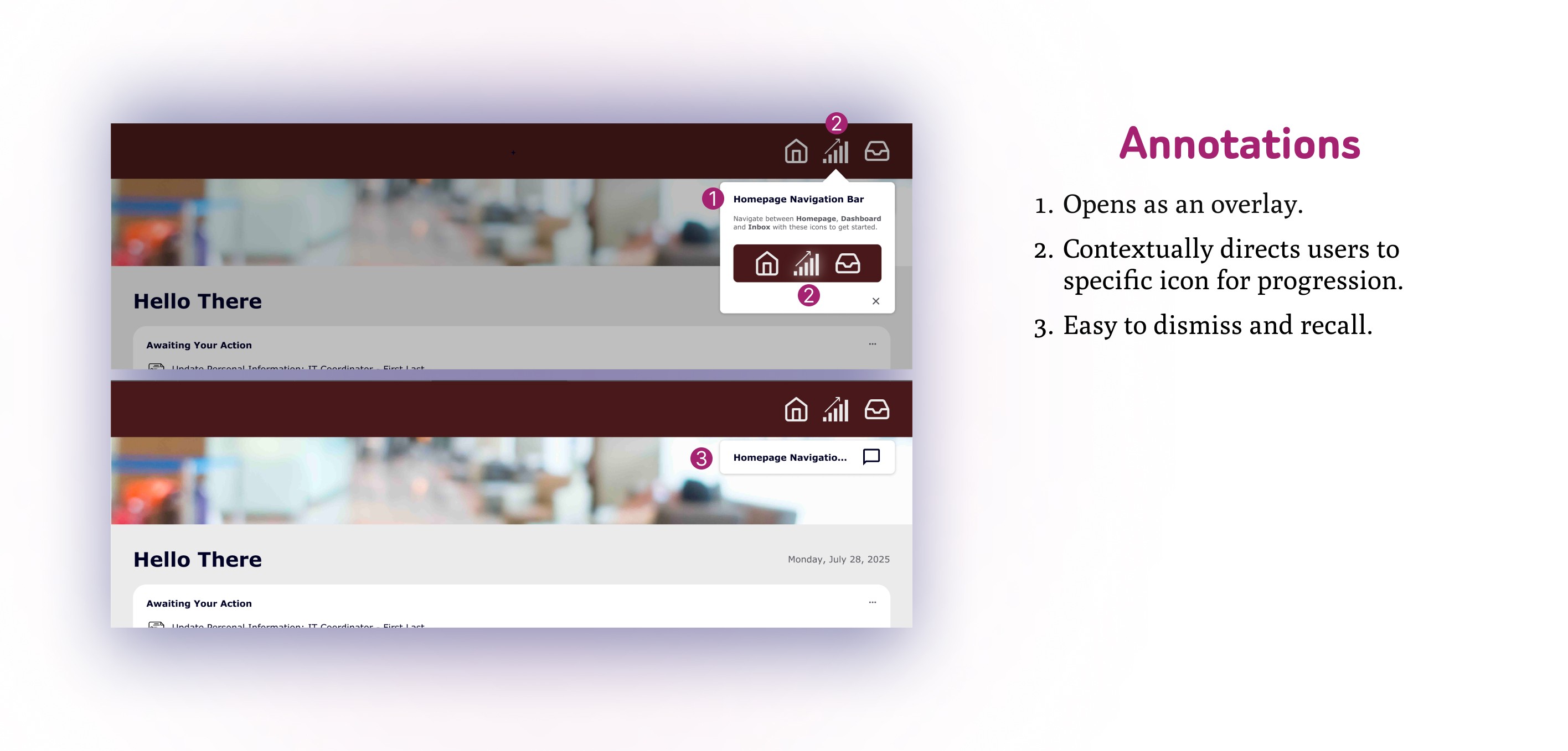
To create something that allows users to notice a feature, I looked into color theory and affordances and signifiers. With color theory, bright and saturated colors are used to signify a notification or something that demands attention. Most often, the most effective color for this is bright red, an element I had abandoned back in one of the earlier iterations. In that iteration, the pull revelation was not labeled and so did not allow itself to be noticed by the user, despite the red badge signifier.
Solution 3 had better usability testing results than before. 3/3 users said they had noticed and understood what the pull revelation were for and 2/3 users clicked on it. 1/3 of users said the pull revelations helped them understand the interface better and the other 2/3 when asked, said they already understood how to use the interface without the pull revelation. Notably, 2/3 users did not feel that the pull revelations were invasive, and they were easy to dismiss and recall. The remaining 1/3 user explained that he was a gamer and doesn't wanted to read instructions, but just complete the task.

By employing a product that can guide new users through a laundry list of onboarding tasks, and encourage said users to be more engaged because of gamification elements, companies can reduce employee turnover rates by up to 31%. The total workforce for the entire tech industry is 9.8 million and the average annual turnover rate for the tech industry is 13.2%. This means that the total amount of turnovers annually is roughly 1.3 million. With a 31% reduction in turnovers, that would reduce it by around 400,000. This breakthrough is monumental, especially when the average cost-per-hire is roughly $4000. With some quick math it boils down to $1.6B for the whole tech industry, and that's not even including soft costs like time and resources spent training, increased workload strain/decreased productivity on existing employees. The return on investment for accounting for new users, user-friendly onboarding software is monumental.

